 Business Queries: +919663372351 | Career Queries: 080-49253909
|
Call us now : Business Queries: +919663372351 | Career Queries: 080-49253909 |
Blog | Careers | News | Sitemap | Contact Us


Neev designed the front end for an easy-to-use web portal. The portal was aimed at raising funds to micro finance people from low income households who needed a small sum of money to start/ grow a business. This enabled RangDe to increase their conversion rate considerably.
Started in 2008, RangDe is an India-based non-profit organization that aims at raising micro loans from the public. This enables funding of a business need for people in the low income strata of society. Borrowing and lending is the micro finance model of RangDe. As of October 2013, RangDe has impacted over 25, 600 borrowers and has raised over 184 million rupees. All this while maintaining a repayment rate of 93.8%. RangDe is a winner of the 2011 Manthan South Asia Awards under the E-inclusion category and has been funded by World Bank through Development Marketplace.
The client required Neev to create a web portal that can:
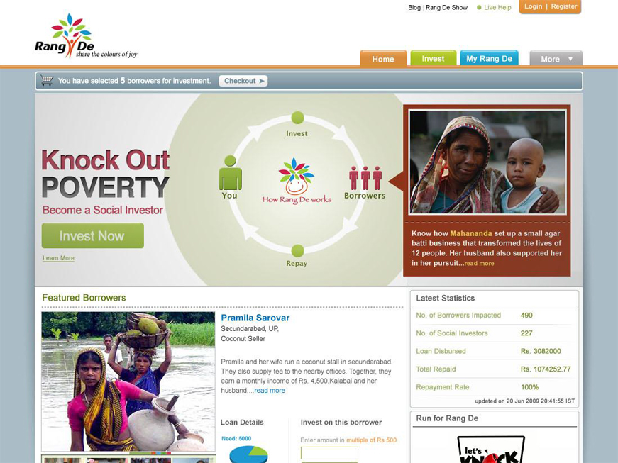
We understood that the sooner we could establish the credibility of the initiative when the user lands on the website, the greater the chances of an enrolment. Hence, we decided that the enrolment process had to be explained intuitively – visually. We then created a simple info graphic to describe the microcredit story.
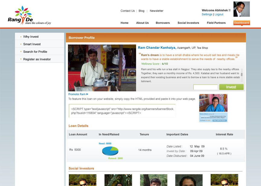
The homepage had to convince the user of the benefits of the platform, and also provide an action plan. We decided to go for an illustrated banner. We also labeled Navigation links like Calls to action. Hence, most of the important information stayed above the fold, easily in the viewer’s sight. All pages except home were made simple to look at, with calls-to-action made bright. The greater the complexity, greater would be the dropouts. For this reason, we simplified navigation by reducing the number of steps involved in most interactions and made the payment process quick. We provided them an easy-to-use interface to track their funds and manage them too. To improve conversions and establish credibility, we created user dashboards and highlighted success stories. Wire framing, user experience design and branding collaterals were created as part of this engagement. We created and evaluated information architecture for the application, listing features with respect to persona. We developed sub-flows with low-fidelity wireframes and worked our way up to complete visual click-flows, iterating as needed. This was done to ensure that most scenarios were covered before the development began.