What’s wrong with Flipkart’s mobile site & how to improve it’s Usability
Contributed by Vinci Rufus on 25 Nov 2012
Flipkart is India’s most popular eCommerce site; many people also refer to it as the Amazon of India.
While the website is quite functional and gets the job done of making sales, the mobile site we found is surprisingly quite outdated, nor is close to being functional.
On a lazy Friday afternoon after lunch our Sr. UX Designer Prashant Kamat and I thought how would Flipkart’s mobile site have looked had we designed it.
Below are a couple of points on what’s really wrong with Flipkart’s mobile site and what could be done to improve it.
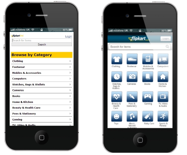
Homepage:

As seen above, the current homepage is quite drab; things that don’t work in its favor are and how we would change it are :
- The large search box and an equally large search button, which people rarely use now a days. Moreover the lack of auto complete is forcing users to type in the whole keyword on the precarious keypad. We thought of putting in a nice rounded corner search box and the lens icon for the Search button. Not only does it save one real estate ( which by the way is premium on mobile) it also isn’t something people use a lot because most users we have seen, hit the submit button after typing in the keyword.
- The categories text links are not even listed alphabetically, which means users go scrolling up and down reading each name until they find the one they are looking for. The other drawback one can see is, only about 9 categories per page. Our design makes use of icons, so that people can scan quickly and easily find the category they are looking for. Also the tabular design fits in 16 categories per screen. We debated quite a bit on whether to use colored icons or go with mono chromes. Prashant won the argument and we decided to go with monochromes .
Product Listing Page:

- Currently after selecting a category, say Footwear, you’ll get a second list of sub categories, to choose from before you can actually see the products. In our Opinion most of the online shoppers who navigate via categories are casual shoppers, who like to browse products and buy it if they find the product interesting. In such scenarios it’s best to show products immediately after selecting a category. Showing a casual shopper another level of sub sections will simply confuse the visitor who will click on a random link and drop off.
- Our design would show the products immediately on selection of a category and we decided to go with a tabular Responsive layout instead of the current vertical listing. the reason being, we are able to show larger pics which look more appealing and more importantly users with high resolution phones will get to see more products per screen, and it would look more balanced rather than the empty spaces on the right that show up in the current-design.
- Another big issue is, there are no breadcrumbs or navigation to jump from one section to another. the User needs to come back to the homepage each time and start all over again.
Product Details Page:

- Surprisingly, we noticed that Flipkart doesn’t allow purchases to be made from mobile for categories where the user needs to choose a size or color. Categories like Shoes, Dresses show nearly all their products as either ‘Out of Stock’ or ‘Permanently discontinued’, even while the same product is available for purchase on the actual site.
- Our design allows the users to select sizes and colors and would allow the users to add the items to cart.
Visit us at Neevtech.com to know more about our offerings.


Leave a Comment