|
Call us now :  Business Queries: +919663372351 | Career Queries: 080-49253909 Business Queries: +919663372351 | Career Queries: 080-49253909 |
Blog | Careers | News | Sitemap | Contact Us

Neev helped OnMobile create an easy-to-use application, Iris, with a simple UI that enabled the client reduce service costs by streamlining operations of its Value-Added Services (VAS) products across various service providers.
OnMobile Global Limited is India’s largest value-added service (VAS) company. Incorporated in 2000, it offers content management, content aggregation, mCommerce solutions, mobile advertising, mobile search, voice portals etc. Headquartered in Bangalore, it was the first Indian telecom VAS Company to go public in 2008.
With their business constantly growing and each mobile operator having their unique VAS plans, OnMobile needed an internal platform to take care of their workflow and validations.
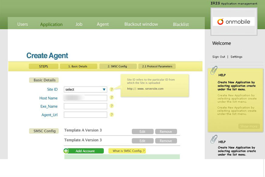
The user did not have a technical bent of mind and hence the UI had to be really simple requiring minimal intervention from OnMobile and no scope for error. The mandate was ease of use, scalability and access to information in a structured format that would help the user navigate through complex workflows to customize as per specific operator requirements.We started with a detailed requirement gathering phase to understand the various use cases. User roles like internal admin, client admin and super admin were defined and their workflow was prioritized and charted out. We brainstormed to arrive at solutions that were captured as wireframes. They defined flow and ensured high usability.
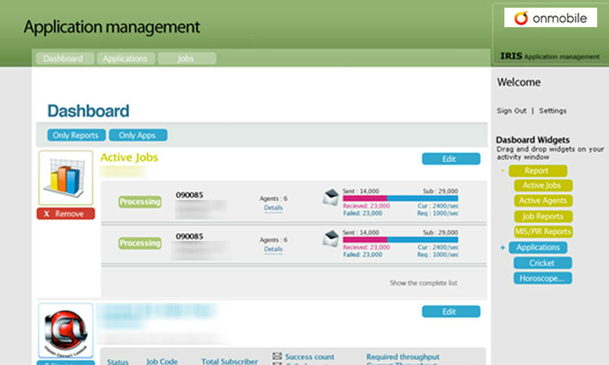
The clickable prototypes created as part of the wire framing phase were crucial in helping the client visualize his requirements with greater clarity. This ensured that both, the client and us were on the same page before we approached the design phase for the interface. The interface thus designed was simple to use, intuitive and had clear highlights on action items on every screen. Shortcuts for all major activities were always on the menu and help cues for administrators were available at all action points. Scalability was ensured by designing workflows in such a way that adding more users at a given point would not affect the system. So, any number of new users could be added at any time. By automating workflow and validations, human errors were reduced and training new employees to use the application was made easier. Automating validations also ensured that the sanity of the workflow was automatically confirmed at different checkpoints in the workflow without human intervention. Admin Modules were added for creation and maintenance of VAS operations. An alarms module was integrated for providing advance alerts about subscription expiry. All these added to the ease of processing requests from Service Providers. The client team was involved with us in discussions and iterations throughout the whole process leading to mutual sign-offs on most design decisions. We delivered HTMLs as a click flow and after development, we worked on back-end integration to give the client a fully working UI.